
Branding for Taunton Vale Catholics pt 1: logo and colour palette
A few weeks ago, Fr Tom Dubois asked me to design a new logo and colour palette for the newly-formed communion of parishes named Taunton Vale Catholics. He also needed a booklet to explain the change to the parishioners - this needed to look fresh and capture attention, as well as effectively deliver some very important messages. My home parish is included in this group so this was a project which was very close to my heart and I couldn’t wait to get started!
Fr Tom had some great ideas about what he wanted the logo to include - namely to have aspects from all four churches to foster the feeling of communion and partnership. We focused on using the patron Saints (or attributes) of each parish with a few other more abstract ideas. You can see the preliminary sketches below.
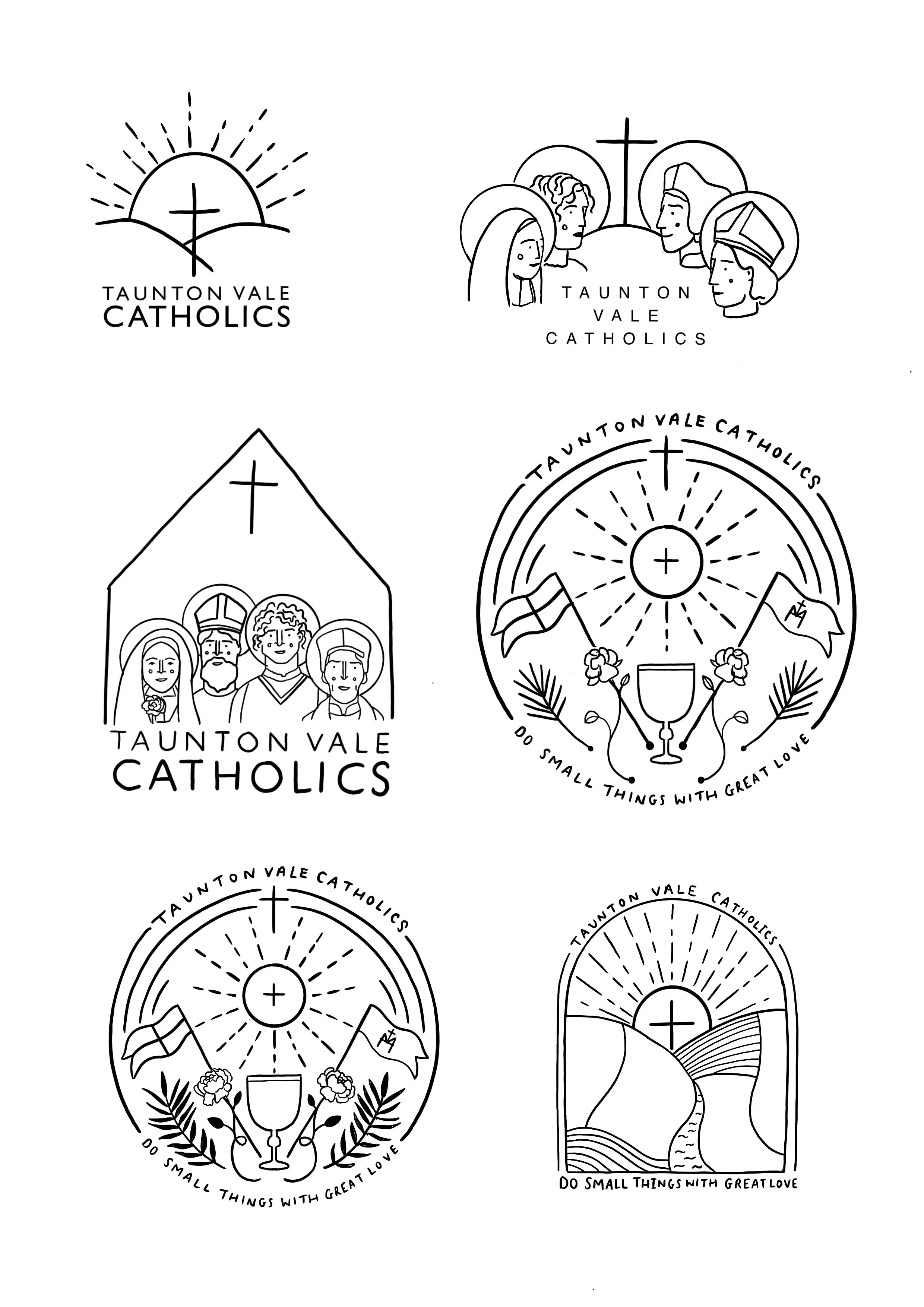
After careful consideration, it was decided that the chosen logo would be the one on the top right. I then redesigned the chosen logo with a small (very small!) nod to Byzantine and classical portraiture. The hand-drawn design was then vectorised to enable its use across different formats and media. The finished logo retains the hand-drawn feel, which I love.

colours
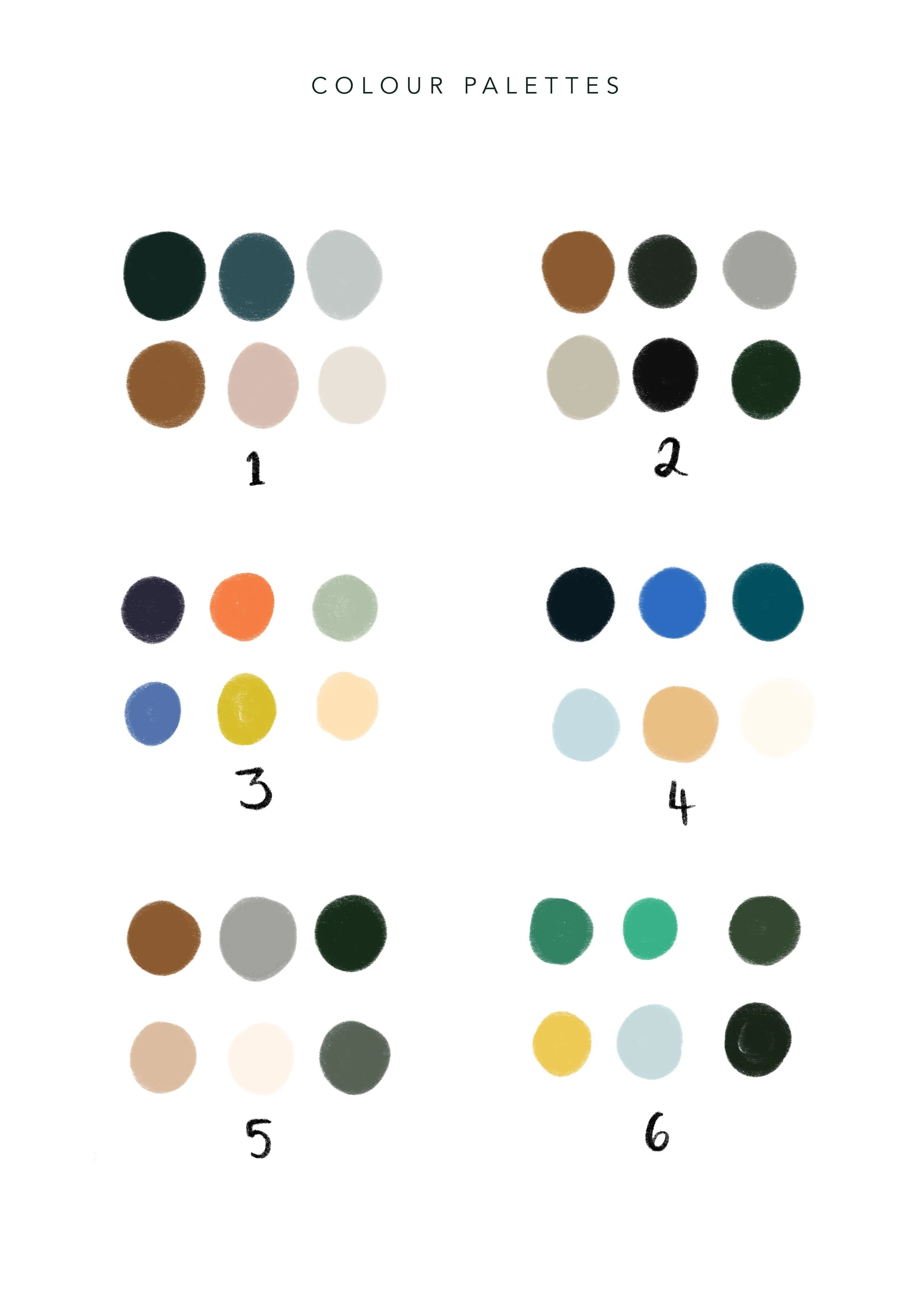
I produced a range of colour palettes with very different colours to get an idea of what would work best for the branding as a whole. Fr Tom was a big fan of the brighter palettes. The colour palette is a vibrant but sophisticated mix of bright, energetic colours to reflect the vibrancy of the new partnership without looking childish. These colours will be used across all media.
Stay tuned for part two of my work for the Taunton Vale Catholics, where I’ll be showing you some illustrations and a booklet!
